Jan 8, 2023
Taking subsetting to the extreme - single glyph fonts

Subsetting is the practice of extracting glyphs from a font and creating a reduced set of the original. Doing so can be useful in the pursuit of smaller font files that are quicker to load, thus avoiding delayed text rendering or having to do a switch-over from a system font. These issues are also known as flash-of-invisible-text (FOIT) and flash-of-unstyled-text (FOUT). Check out the writings by Zach Leatherman for a deep dive on font loading.
The most popular font on Google Fonts, Roboto, contains 1294 glyphs covering a whopping 311 languages. As the astute reader may have already noticed, this writing is in English - if I were to hand you the full Roboto font, there would be about 1200 glyphs unused. Getting rid of those unused glyphs is the point of subsetting.
This blog post contains 91 glyphs (as counted by Glyphhanger), and ideally, that'd be all you'd download. Having a bespoke font file for every page is not particularly practical, however, nor is it optimal when a user visits multiple pages of the same site. In this case, we would want the font file to be downloaded once and then retrieved from cache on subsequent requests. The fastest download is the one we don't need at all.
A good middle ground is to settle on a base font file that covers the most used glyphs - typically those found on a standard keyboard - and offer additional glyphs for edge cases in one or several separate font files. The key, then, is to specify exactly what glyphs each font file contains in the font-face declaration of your CSS. That way, the browser knows where to get the font files for the glyphs it encounters while parsing the HTML.
Additionally, having the base font be a variable type can save bandwith if we're planning to use multiple weights or other variations for which we'd normally have to use individual font files. In the following I'll be using Roboto Flex with weight as a variable axis.
Here's what the CSS could look like:
@font-face {
    font-family: "Roboto Flex";
    src: url("base-font.woff2") format('woff2');
    font-weight: 300 800;
    unicode-range: U+20-22,U+27-29,U+2B-3B,U+3F-4A,U+4C-50,U+52-55,U+57,U+59,U+5A,U+61-7B,U+7D,U+A9;
}
@font-face {
    font-family: "Roboto Flex";
    src: url("/greek-alphabet-lowercase.woff2") format('woff2');
    font-weight: 300 800;
    unicode-range: U+03B1-U+03C9;
}
The magic property is unicode-range. The aforementioned tool, Glyphhanger, can help you figure out what unicodes and ranges are needed.
With the reasonable approach covered, it's now time to turn it up to 11 and go extreme!
Well, as extreme as a blog post on font loading strategies can be. Here's the idea:
We take the full font file, all 895 glyphs for Roboto Flex, and separate it into 895 files, each containing a single glyph. For each of these, we write a font-face declaration with the "unicode-range" property set to the unicode for the single glyph contained in that particular file.
It will look something like this:
@font-face {
    font-family: "Roboto Flex";
    src: url("U+d.woff2") format('woff2');
    font-weight: 300 800;
    unicode-range: U+d;
}
@font-face {
    font-family: "Roboto Flex";
    src: url("U+a0.woff2") format('woff2');
    font-weight: 300 800;
    unicode-range: U+a0;
}
@font-face {
    font-family: "Roboto Flex";
    src: url("U+20.woff2") format('woff2');
    font-weight: 300 800;
    unicode-range: U+20;
}
...
Yes, with a font-face declaration for each glyph that makes for a rather large CSS file! Thankfully, it compresses extremely well, coming in at 6 kB.
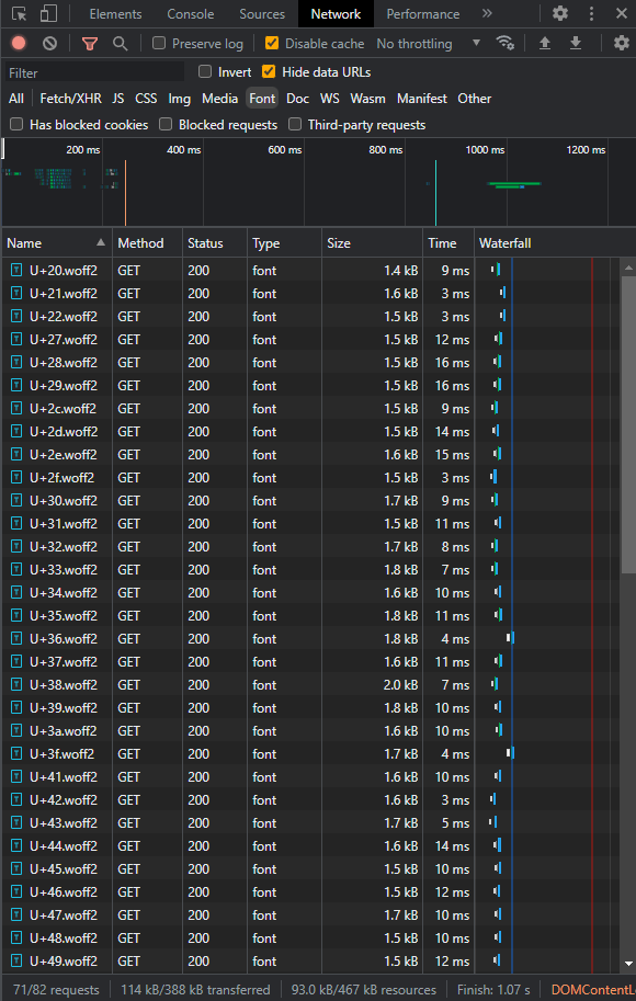
Here's a look at the network log:

With this approach, you can use the full set of glyphs, yet only ever download the exact set needed for a page. A set that will be cached, so when you visit other pages on the site, you'll just need to download the few extra ones you're missing. Brilliant, right?!
No, it's pretty stupid. But it made for a fun little experiment! The problems with this approach are significant.
First of all, it takes more time to download a hundred 1 kB files than a single 100 kB file - especially on higher latency connections, where the extra milliseconds on each request-response quickly add up.
Similarly, a font file for 1294 glyphs isn't 1294 times larger than a font file for just 1. These things compress rather nicely, so contrary to the goal that got us started to begin with, splitting a font into too many parts will actually increase the overall download size. On this site, I use the variable version of the Roboto font - Roboto Flex - with weight as the only axis. A reasonable subset of this comes in at about 22 kB for 145. The single-glyph files sit at between 1.5 kB and 2 kB each. The full set consisting of 895 glyphs hits 67 kB. There's clearly a sweet spot for subsetting!
Looking at the numbers, it may seem like wasted effort to even do the regular subset when it only saves us about 40 kB. And granted - there are other performance optimizations that should be done first. But it's important to remember that these 40 kB make up a very critical part of the initial render, without which we'll either have to deal with invisible text or settle for a temporary substitute font. This is the FOUT and FOIT issues again. Every millisecond counts - milliseconds that can be quick to rack up on slower connections. Of all the things that can - and certainly should - be lazy loaded, the main font isn't one of them.
Article illustration generated by DALL-E 2