Grid gut - and save a few bits in the process!
When CSS Grid became widely available in the spring of '17 it not only gave us a fantastic tool to build new and exciting layouts, it also made it possible to weed out much of the complexity that older layout algorithms had forced us to sprinkle everywhere across our HTML and CSS.
In this short post I’d like to highlight a neat use for Grid that I came across while building my Stripe imitation, which managed to cut down on both markup and styling complexity. As someone much smarter than me once said: Why waste bits write lot HTML CSS, when few bits do trick? (Autocorrect is yelling at me right now)
Let's first look at what I recreated:

The stripes of Stripe, essentially. Small pieces of flavor to mark the transition from one section to the next. What’s not captured in the screenshot is the extremely subtle sliding effect caused by translating the two short stripes according to the viewport position, so that the overlap between the long and short stripes increases as the user scrolls down. It is only about 13 pixels, so I bet most don’t notice. I certainly didn’t!
The markup consists of 8 divs in two groups of 4, with a handful of classes on each to apply the styling that amounts to about 150 lines of CSS. Granted, many of those are custom properties and associated infrastructure, but it does give a decent impression of the complexity at play nonetheless.
The original implementation uses absolute positioning and about 16 calc(...) functions to get the job done. The sliding effect is handled with Javascript and a basic translation. Note that the color of the overlap isn’t due to an opacity effect, but an actual third stripe sitting in between the two bigger ones to create the illusion of color mixing.
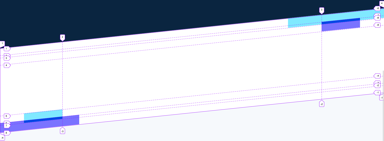
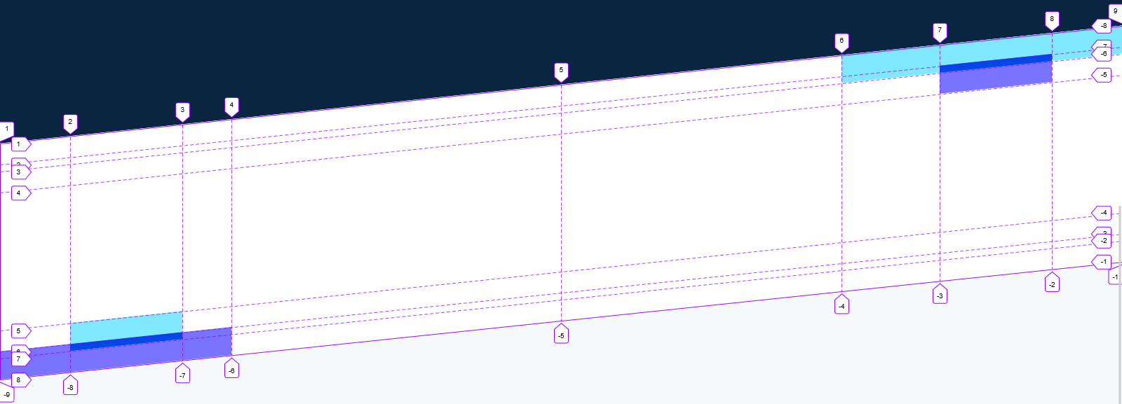
My implementation uses a single parent div with 6 children divs, where all styling happens on the parent with the help of child-selectors. This is what it looks like using the grid-inspector in Firefox:

The parent div needs just a handful of properties on it, with each of the six children elements sitting at about the same. I chose not to implement the sliding effect as I deemed it too subtle to warrant the extra javascript, but the choice of a grid layout wouldn’t be an obstacle.
From the sass-file:
&__stripe {
    @include slant($stripe-white);
    display: grid;
    grid-template-columns:
        minmax(16px, 1fr)
        minmax(0, 1080px)
        minmax(16px, 1fr);
    grid-template-rows: 30px 10px 30px 1fr 30px 10px 30px;

    & div:nth-child(1) {
        grid-column: 3;
        grid-row: 1/3;
        background: #80e9ff;
        width: calc(100% + min(10vw, 140px));
        justify-self: end;
    }

    & div:nth-child(2) {
        grid-column: 3;
        grid-row: 2/4;
        background: #7a73ff;
        width: 160px;
    }

    ...
To me, the use of Grid makes the markup and styling much, much easier to reason about. Even without the use of well-named custom properties, it isn’t difficult to figure out what values must be adjusted should the intersection need to be widened for instance. This is aided greatly by grid-inspection tools. Although the grid only sizes the height (rows) of the stripes, it creates stable and easily handled anchors points that would have taken much more work to find using absolute positioning.
An option to further minimize the styling on the children remains. It does result in a pretty gnarly looking grid-column-property and is definitely not as easy to approach as the first solution.
&__stripe{
    @include slant($stripe-white);
    display: grid;
    grid-template-columns:
        minmax(0px, 1fr)
        clamp(16px, 16px + 100vw - 1080px, 160px)
        min(5vw, 70px)
        minmax(0, calc(1080px / 2 - min(5vw, 70px)))
        minmax(0, calc(1080px / 2 - min(10vw, 140px)))
        min(10vw, 140px)
        clamp(16px, 16px + 100vw - 1080px, 160px)
        minmax(0, 1fr);
    grid-template-rows: 30px 10px 30px 1fr 30px 10px 30px;

    & div:nth-child(1) {
        grid-column: 6/-1;
        grid-row: 1/3;
        background: #80e9ff;
    }

    & div:nth-child(2) {
        grid-column: 7/8;
        grid-row: 2/4;
        background: #7a73ff;
    }

    ...
Some of the ugliness can be amended by naming the columns, using custom properties and sass-variables, and by recognizing the symmetry at play. Notice how both height and width of the children divs are now entirely determined by the grid.

Notes
- Blog page snippet photo by Markus Spiske on Unsplash